VJ Talk
Viva Jovem Talk is the videocast that turns Viva Jovem into conversation. Our job was to build the complete identity of that call — from the symbol to the talk table — for a brand that provokes thought without losing warmth.
- — 01
Breaking the mold of the traditional religious niche without losing legitimacy with the original community.
- — 02
Translating 'thinking' as the core concept into a young visual language, without falling into the generational obvious.
- — 03
Sustaining the same brand on the microphone, in the vertical reel and on printed material.
- — 04
Building a tone of voice that is welcoming without being passive, provocative without being invasive.
- + 01
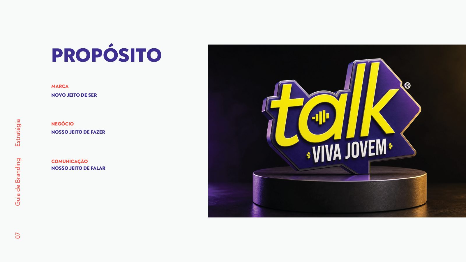
The 'talk' wordmark as the central typographic gesture — young, agile and free of religious iconography.
- + 02
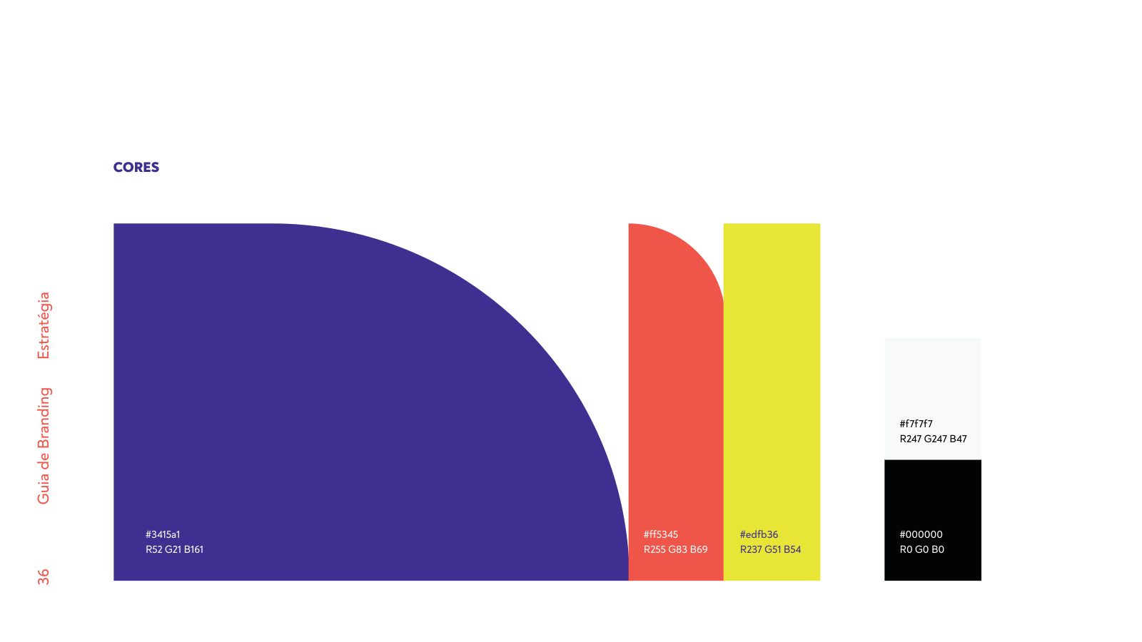
A restricted palette: deep purple as the base, electric yellow as a rare accent that communicates energy.
- + 03
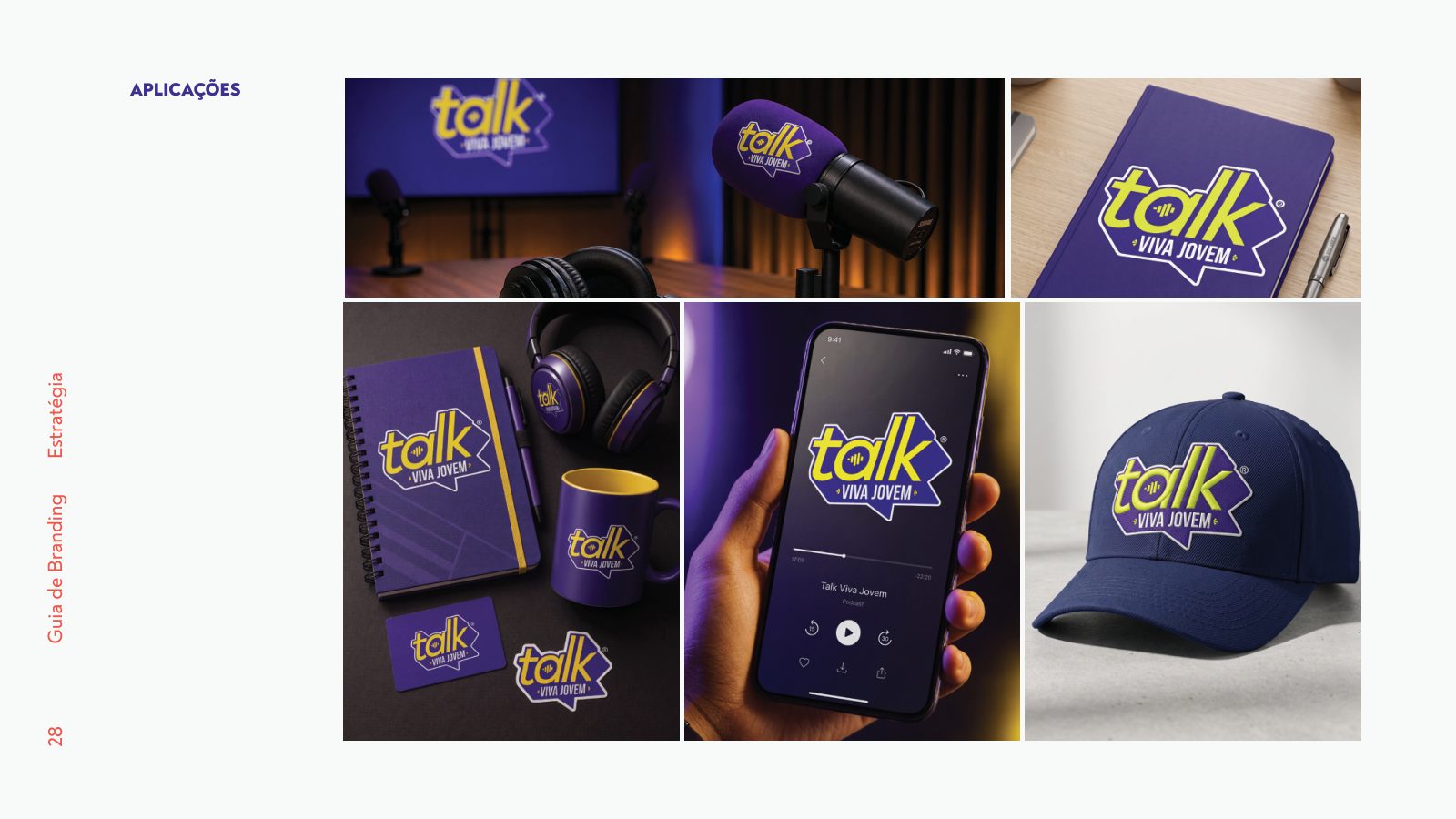
A modular application system: microphone, headphones, notebook, mug and stickers share the same grammar.
- + 04
A proprietary verbal territory — 'VJ Talk, wow!', 'Stories that inspire' — that creates instant recognition.
Brand guidelines
Applications
The project was born as an evolution of Viva Jovem: a videocast focused on sharing experiences, life lessons and the views of health and career specialists, aimed at a young audience looking for clarity in a world saturated with conflicting information.
The young Christian niche suffers from caricatured communication, stuck in worn-out visual codes and a pastoral tone that feels distant. It lacked a brand with visual authority — one able to break the traditional religious mold without disconnecting from its core values.
We positioned the brand as the conversation table: welcoming, provocative, disruptive and accessible. The purpose — "Passionate about stories that inspire" — guided every decision. Deep purple, electric yellow and condensed uppercase typography as the signature of a way that is young, agile and free of visual taboos.
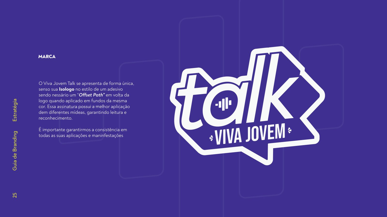
We built the system from the gesture of conversation: the speech bubble as territory, the 'talk' wordmark in Noah Heavy Black as the main voice, the 'VIVA JOVEM' tagline as a constant signature. Every application — from the microphone to the t-shirt — was designed to work on set, in the reel and at the table.
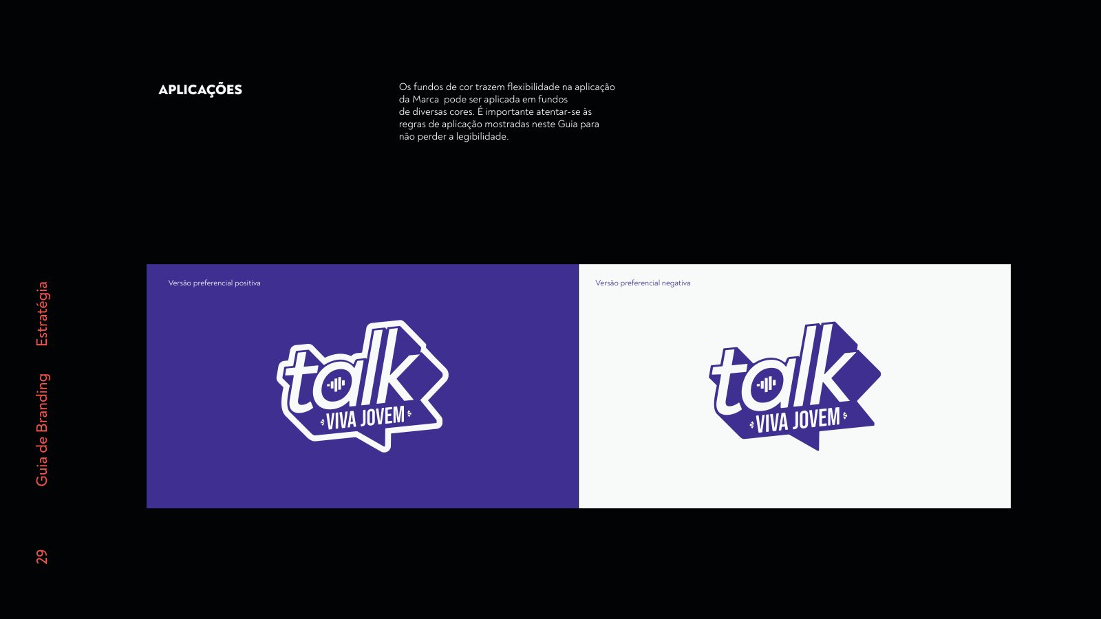
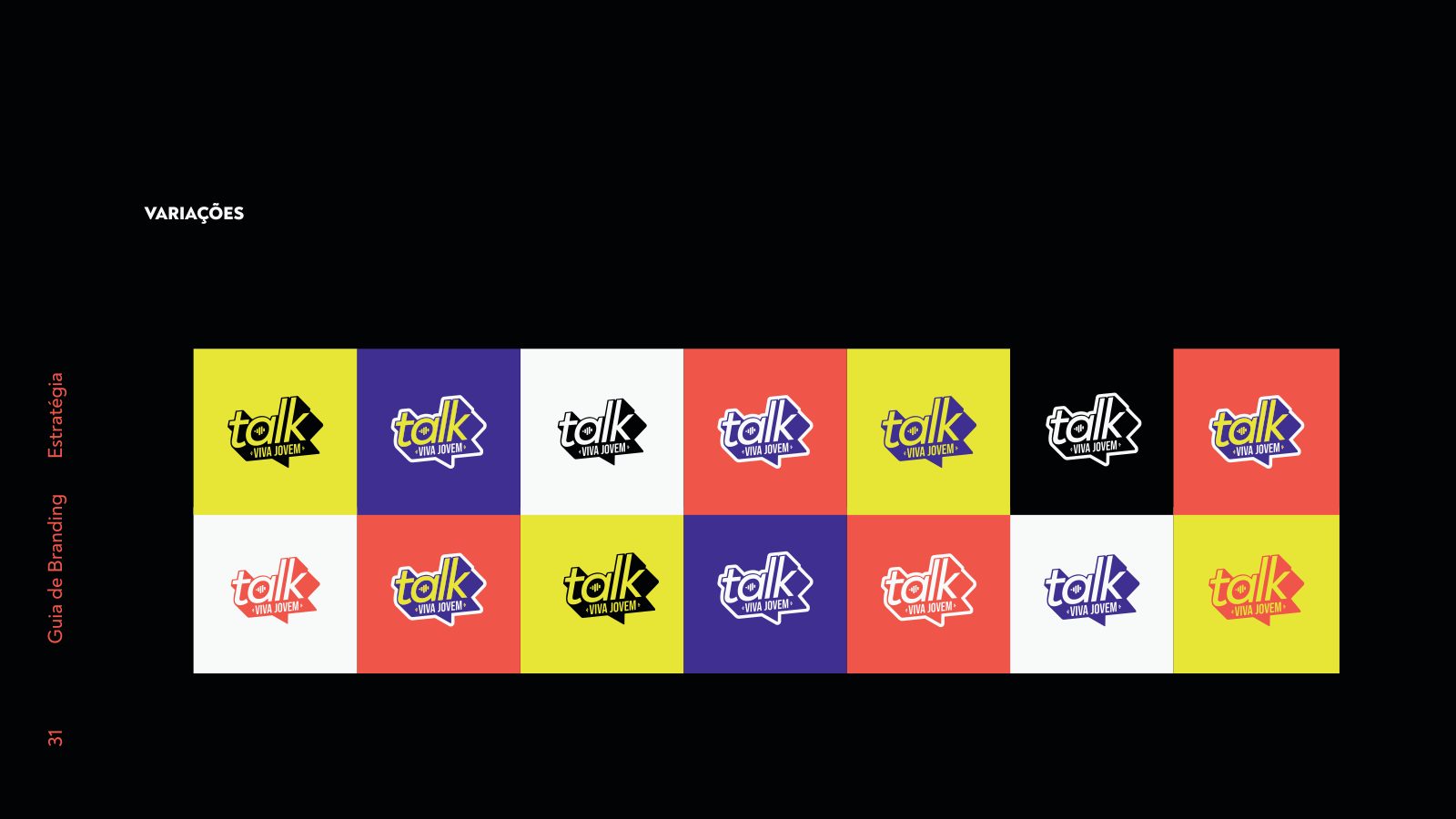
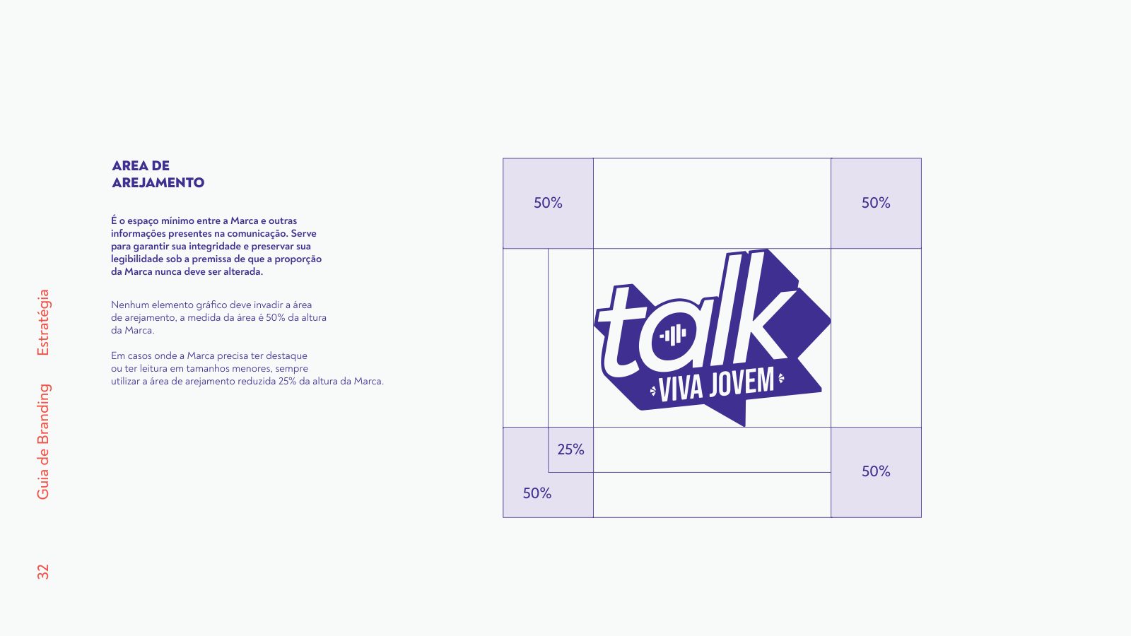
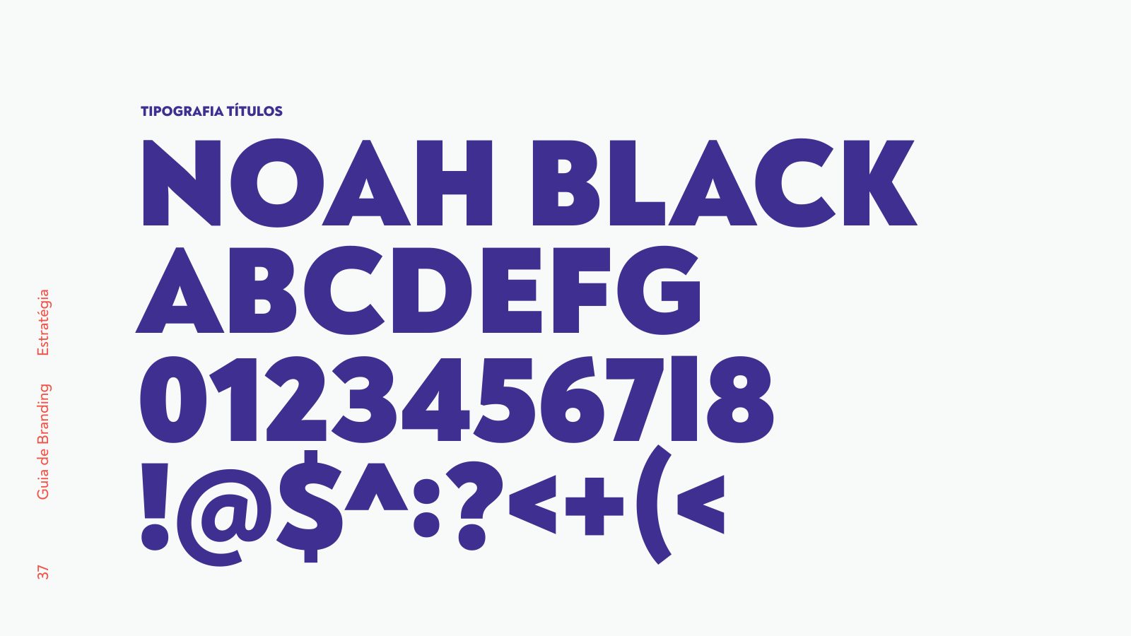
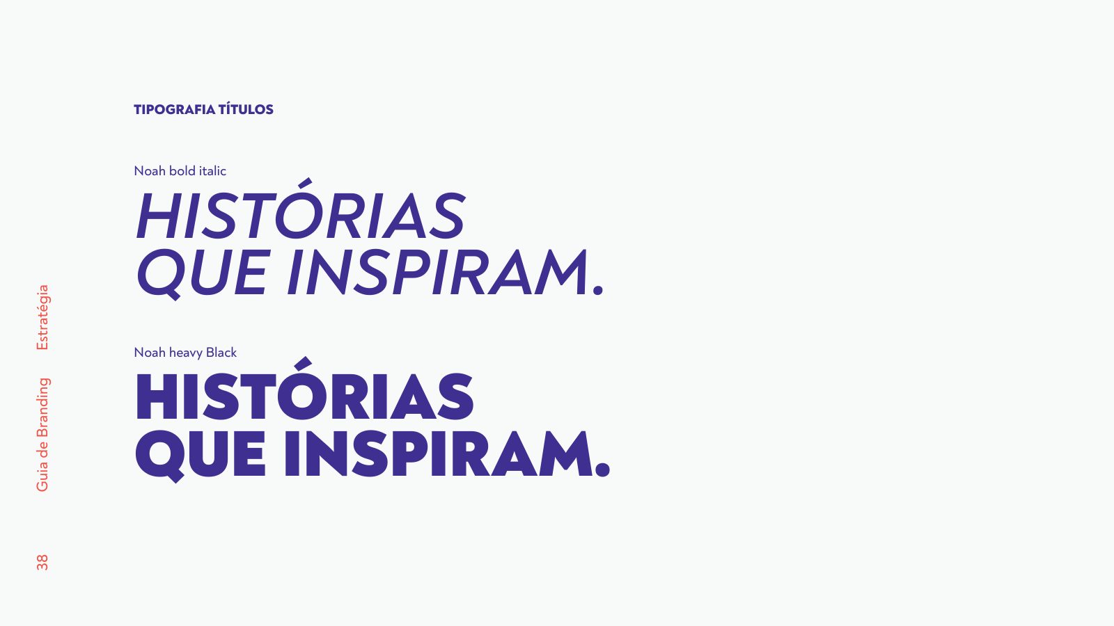
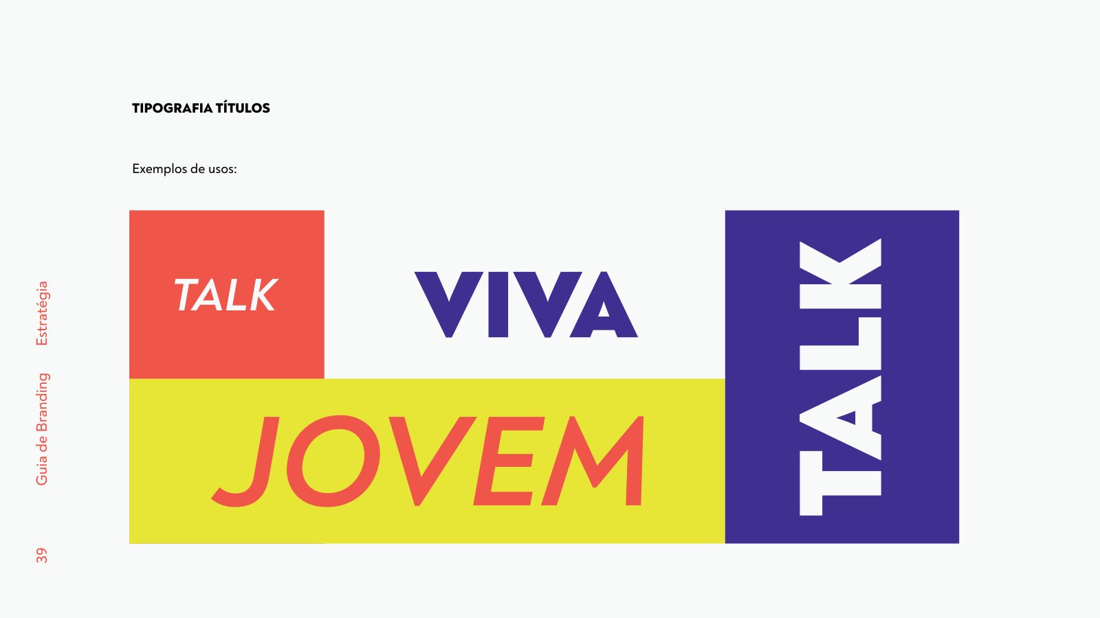
'talk' wordmark in Noah Black typography — a young, disruptive presence. Primary palette in deep purple (#3415A1), electric yellow (#EDFB36), coral (#FF5345), off-white (#F7F7F7) and absolute black. Noah Bold Italic and Noah Heavy Black typography for headlines. A modular application system: microphone, headphones, notebook, mug, cap, stickers and digital interface.
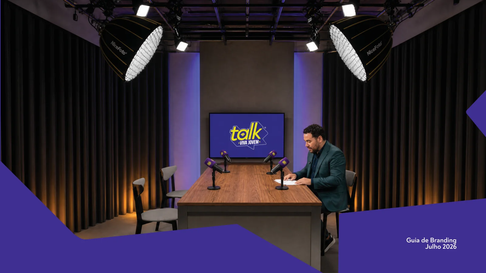
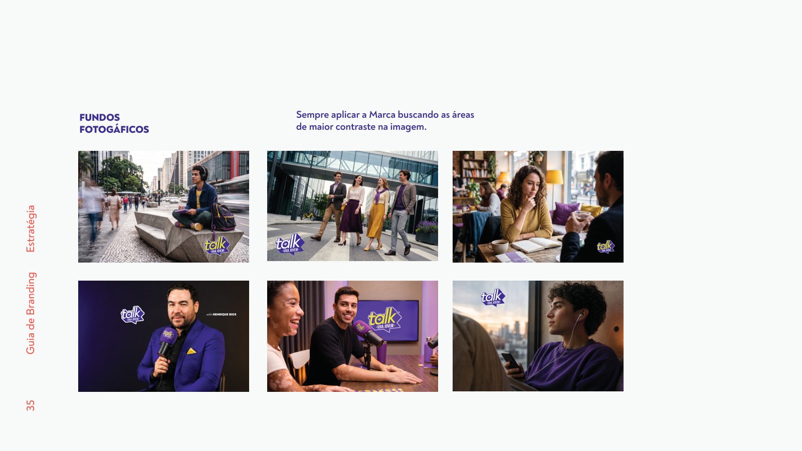
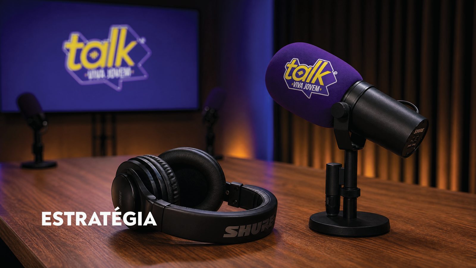
A videocast in a studio set — wooden table, textured curtain, amber and purple lighting. The brand projected on the screen as scenery and on the microphone as the signature of every cut published on the platforms.
A complete visual system in operation — from the brand book to the physical experience of the studio. Viva Jovem Talk gained visual authority equal to the depth of the conversations it sets out to host.