Raízes

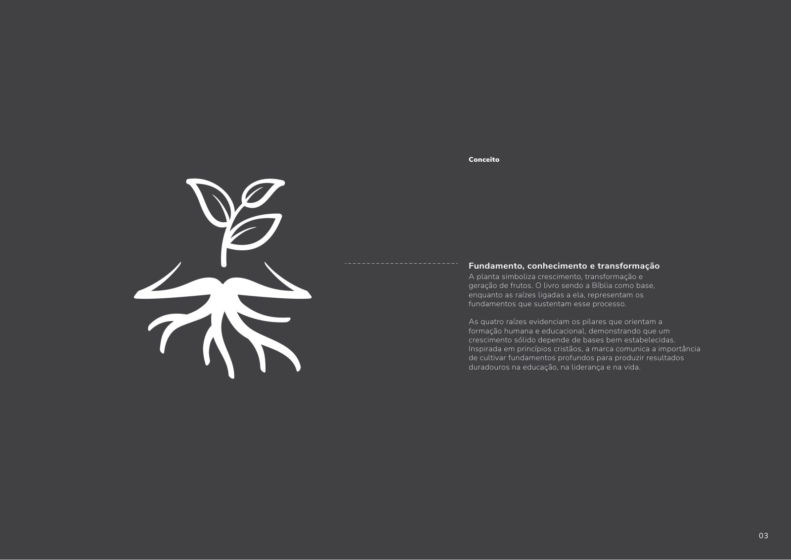
Raízes — Educational Solutions was born from the call to reconnect with the educator who got lost in routine. Our job was to translate that purpose into a symbol: the plant that grows from the Bible, sustained by four roots — physical, intellectual, emotional and spiritual — the pillars of a complete education.
- — 01
Translating Christian spirituality without falling into obvious iconography or religious cliché.
- — 02
Differentiating the brand from an ocean of generic, coach-like educational communication.
- — 03
Sustaining visual authority while keeping warmth — the brand had to be firm and maternal at the same time.
- — 04
Building a flexible system that would serve both partner schools and the end audience (educators).
- + 01
A symbol built as an organic metaphor: the Bible as soil, the plant as fruit, the four roots as pillars of integral formation.
- + 02
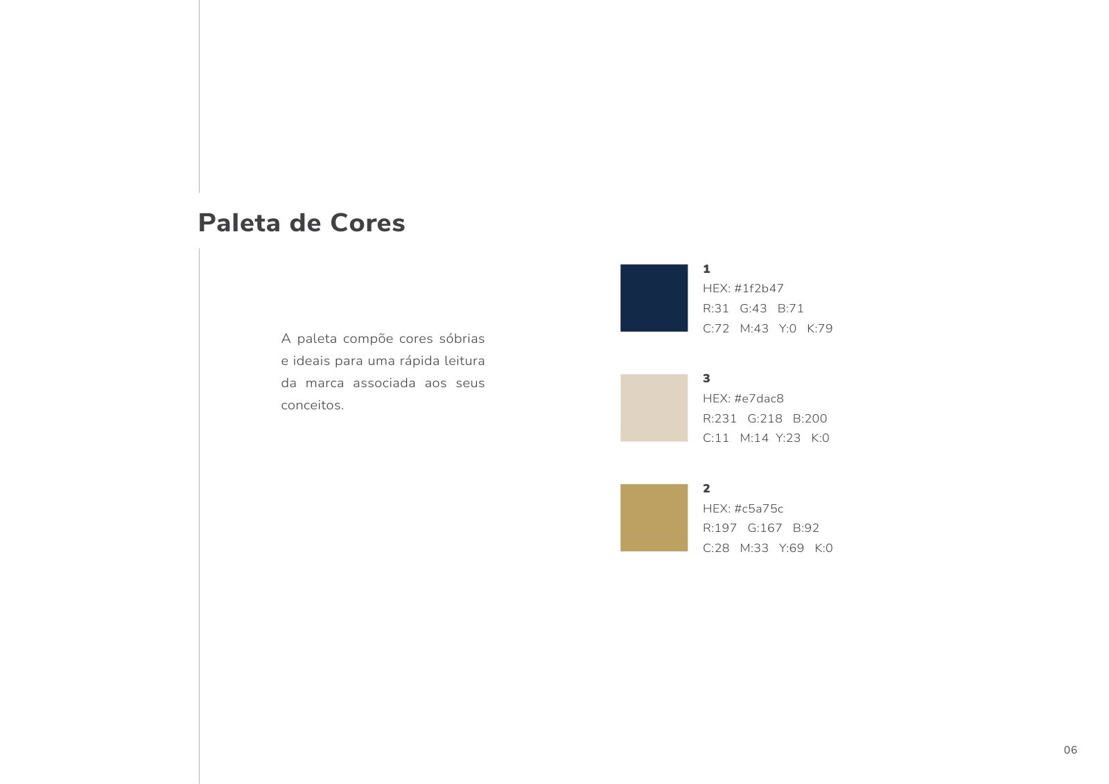
A restrained palette of three sober colors — midnight blue, gold and sand — that reject gradients, rainbows and visual noise.
- + 03
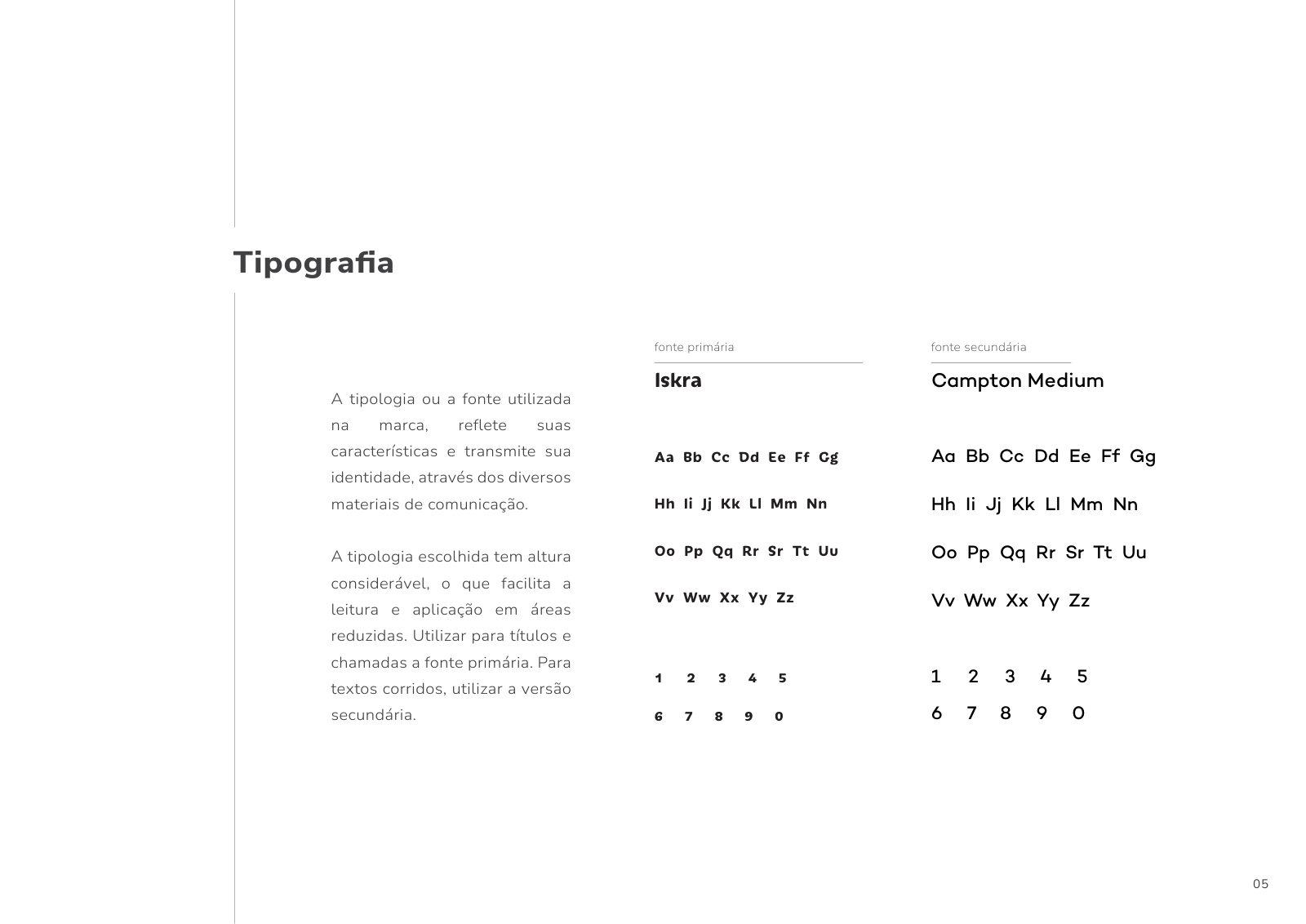
A typographic system with Iskra (high legibility, presence) and Campton Medium (long-form reading text), ensuring clear hierarchy.
- + 04
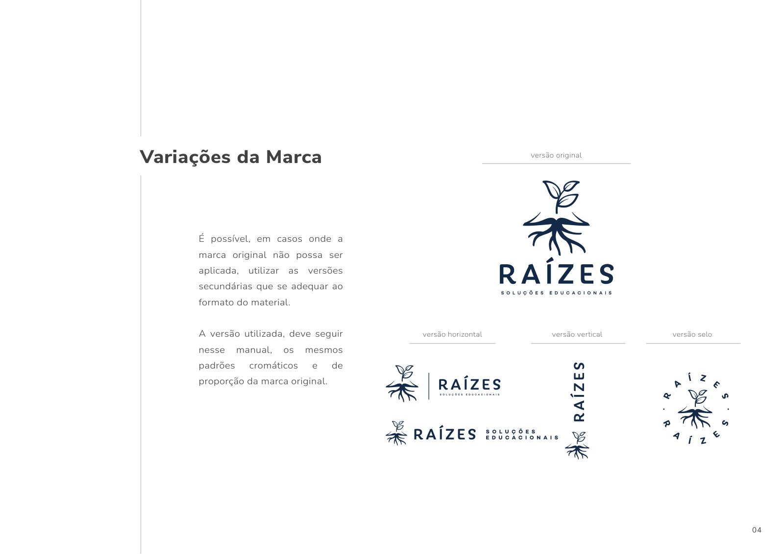
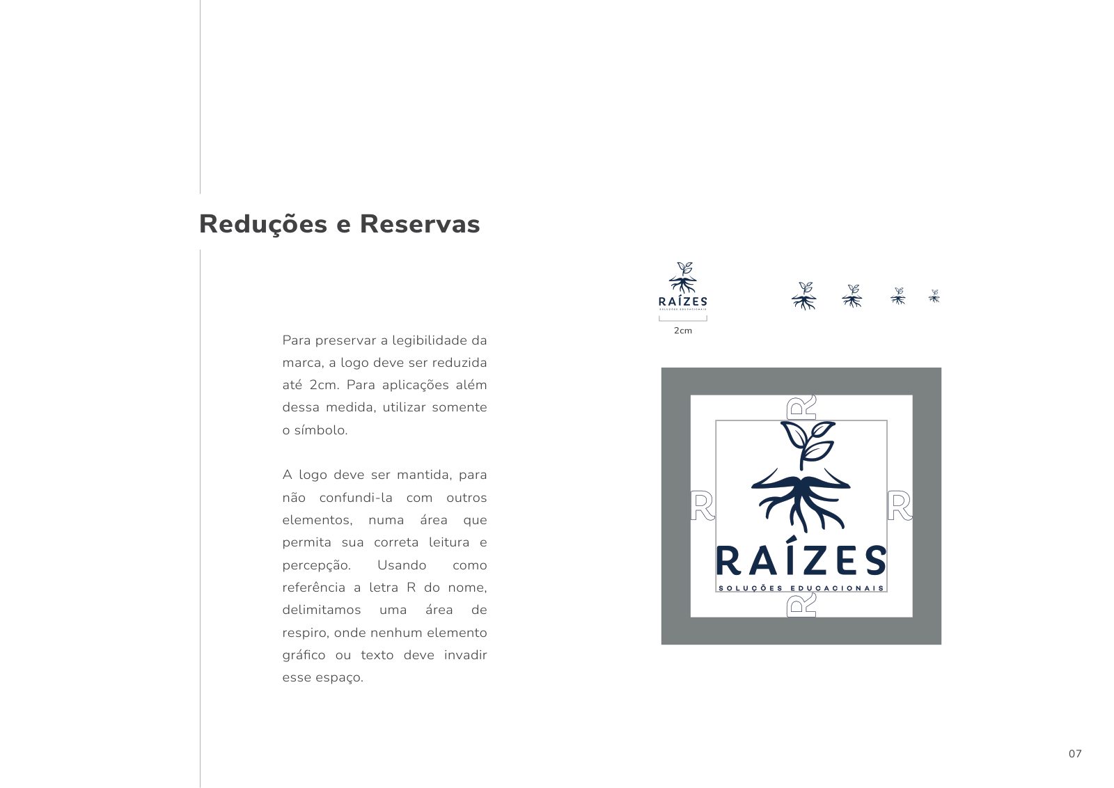
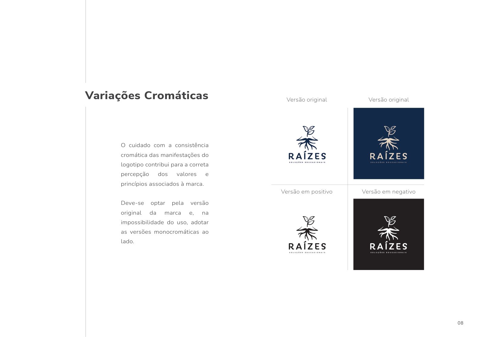
Four brand variations (original, horizontal, vertical, seal) and positive and negative color versions for any application.
Brand guidelines
Applications


Founded by Leonardo, Raízes is a consultancy dedicated to Christian schools and institutions that value the complete formation of the human being. It promotes the integral development of teachers, students and families, combining scientific and pedagogical principles with Christian values.
Educators arrive exhausted, isolated and unrecognized. The sector's communication is generic, full of AI-generated visual clichés and shallow speeches that reduce education to targets. It lacked a brand that sounded like a calling — not like a course.
We positioned Raízes as an ecosystem, not coaching. Direct, welcoming and provocative — a voice of authority that gives dignity back to the teacher. Conceptual core: Purpose. Declared enemy: the superficiality that made educators forget their essence.
We mapped the four pillars of the integral educator (physical, intellectual, emotional and spiritual) and translated each into a root of the symbol. The Bible appears as the literal base of the drawing: from it the plant sprouts, and on it the roots are sustained.
An authorial symbol: a plant emerging from the open book, with four visible roots. Iskra typography for headlines and calls; Campton Medium for body text. A sober palette: midnight blue #1F2B47, gold #C5A75C and sand #E7DAC8 — colors that suggest Christian sobriety without falling into religious cliché.
An institutional intro in two versions: a complete, narrative one, and a simple one in blue — for different application contexts (events, social media, course openings).
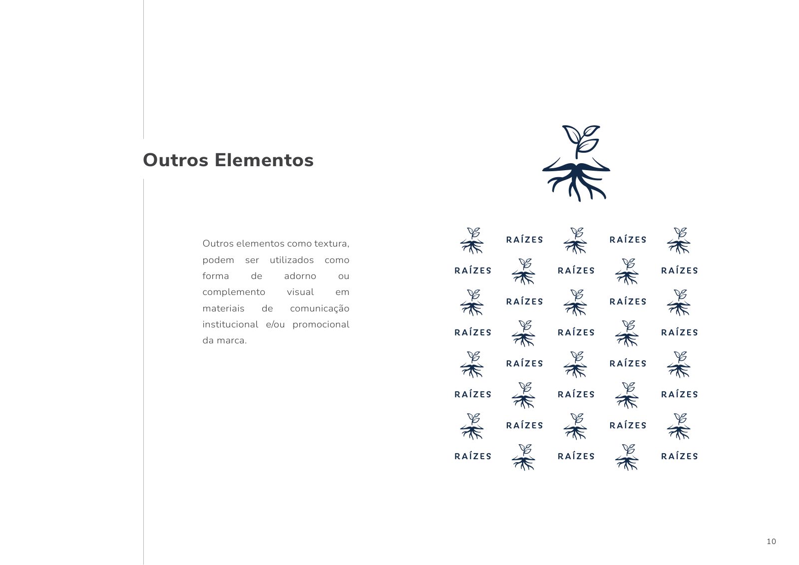
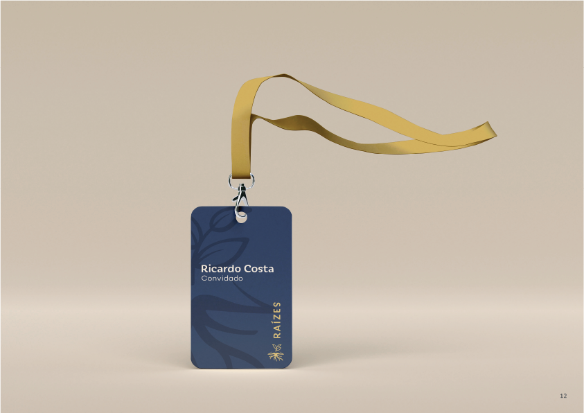
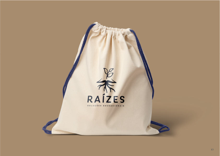
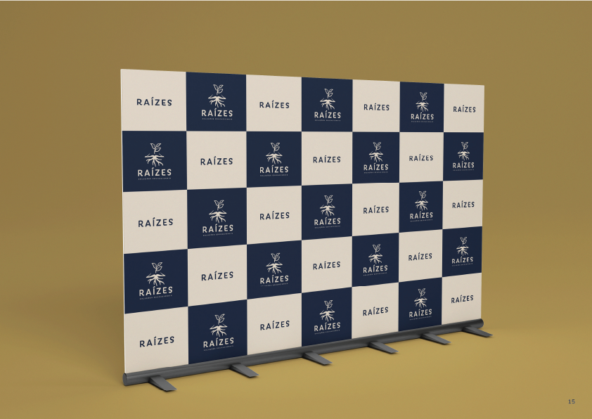
A complete visual system, with a brand guidebook, institutional applications (badge, tote bag, uniform, stationery) and an audiovisual identity ready to scale across courses, talks and continuing education.