Marquez Filmes
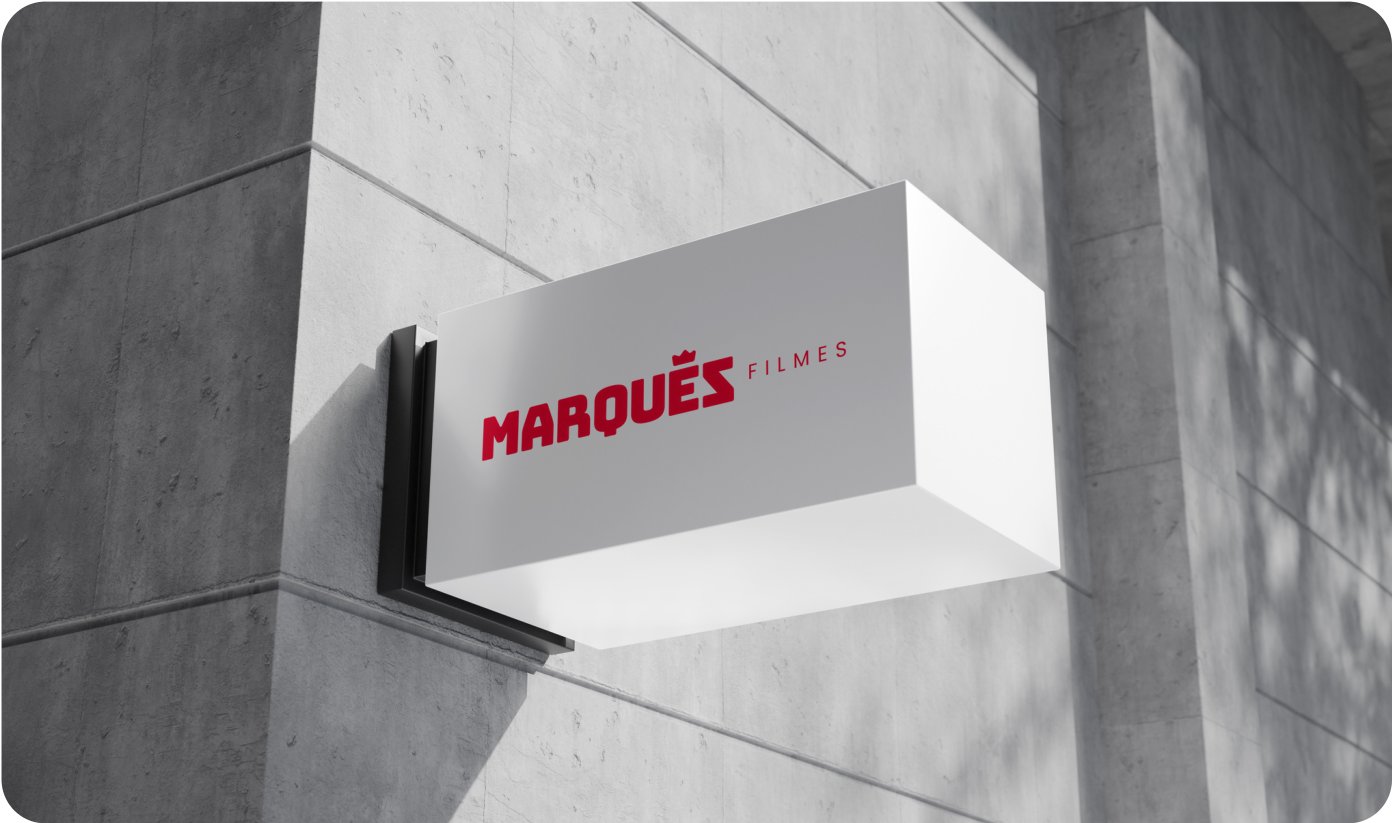
Marquez Filmes was born from the authorial gesture of Fabricio Marques — a director of photography and colorist with more than a thousand hours of streaming in Brazil and abroad. Our work was to turn that discipline into a brand: a visual system worthy of a production company that doesn't make videos — it makes films.
- — 01
Translating more than a thousand hours of technical experience into a visual language that sounds like cinema — not a portfolio.
- — 02
Balancing authority and approachability: the brand had to impress marketing directors without intimidating smaller clients.
- — 03
Standing out in a market saturated with companies that confuse quality with the number of filters.
- — 04
Sustaining the same language in environments as different as a live broadcast and a team T-shirt.
- + 01
The crown as a symbol — royalty built into the 'M', reinforcing the noble origin of the surname without falling into heraldry.
- + 02
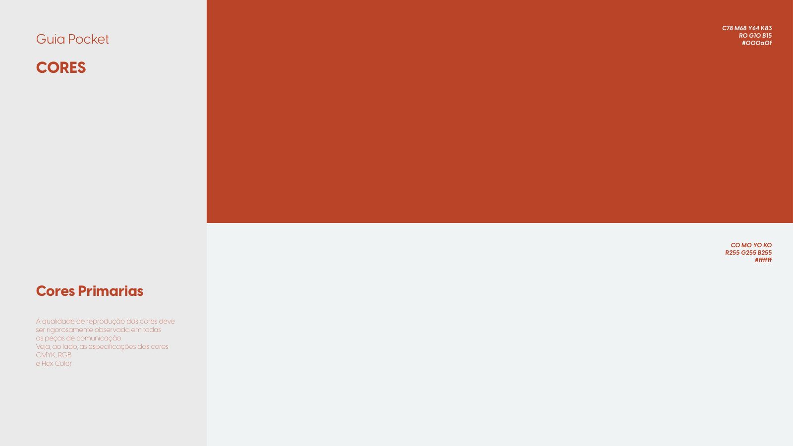
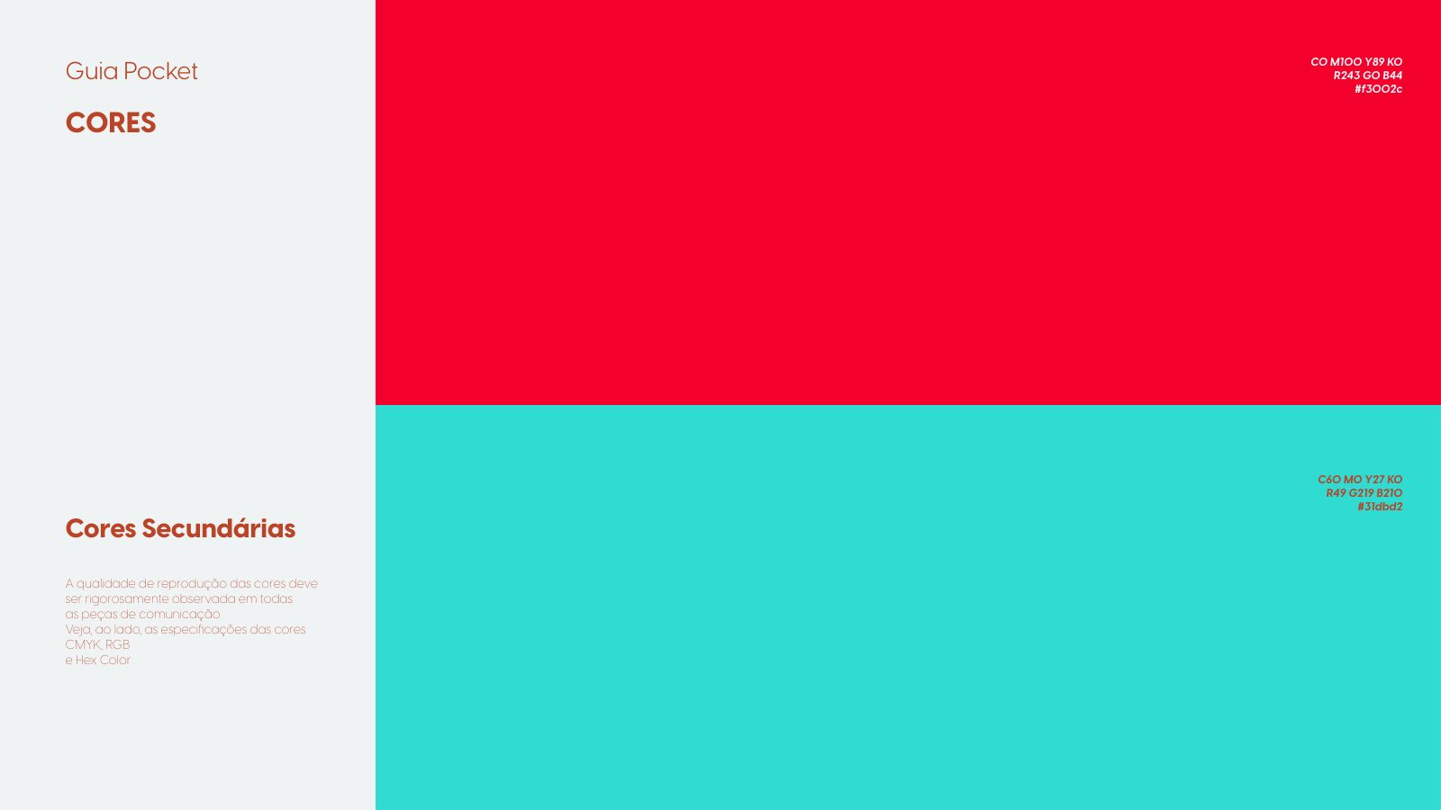
A restricted palette: black and white as the base, red and cyan as rare accents — when they appear, they communicate intent.
- + 03
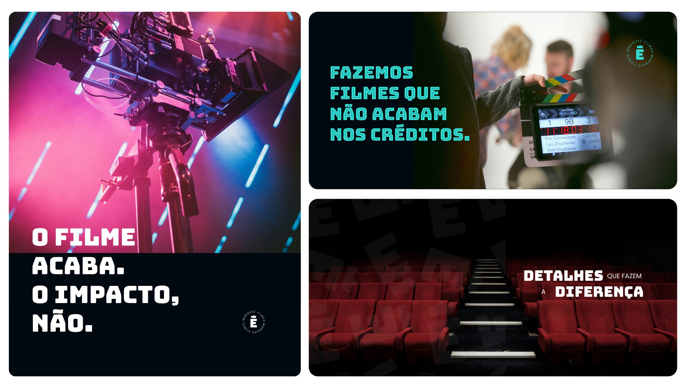
An authorial manifesto guiding every piece: 'The film ends. The impact doesn't.' — a tagline that became a campaign signature.
- + 04
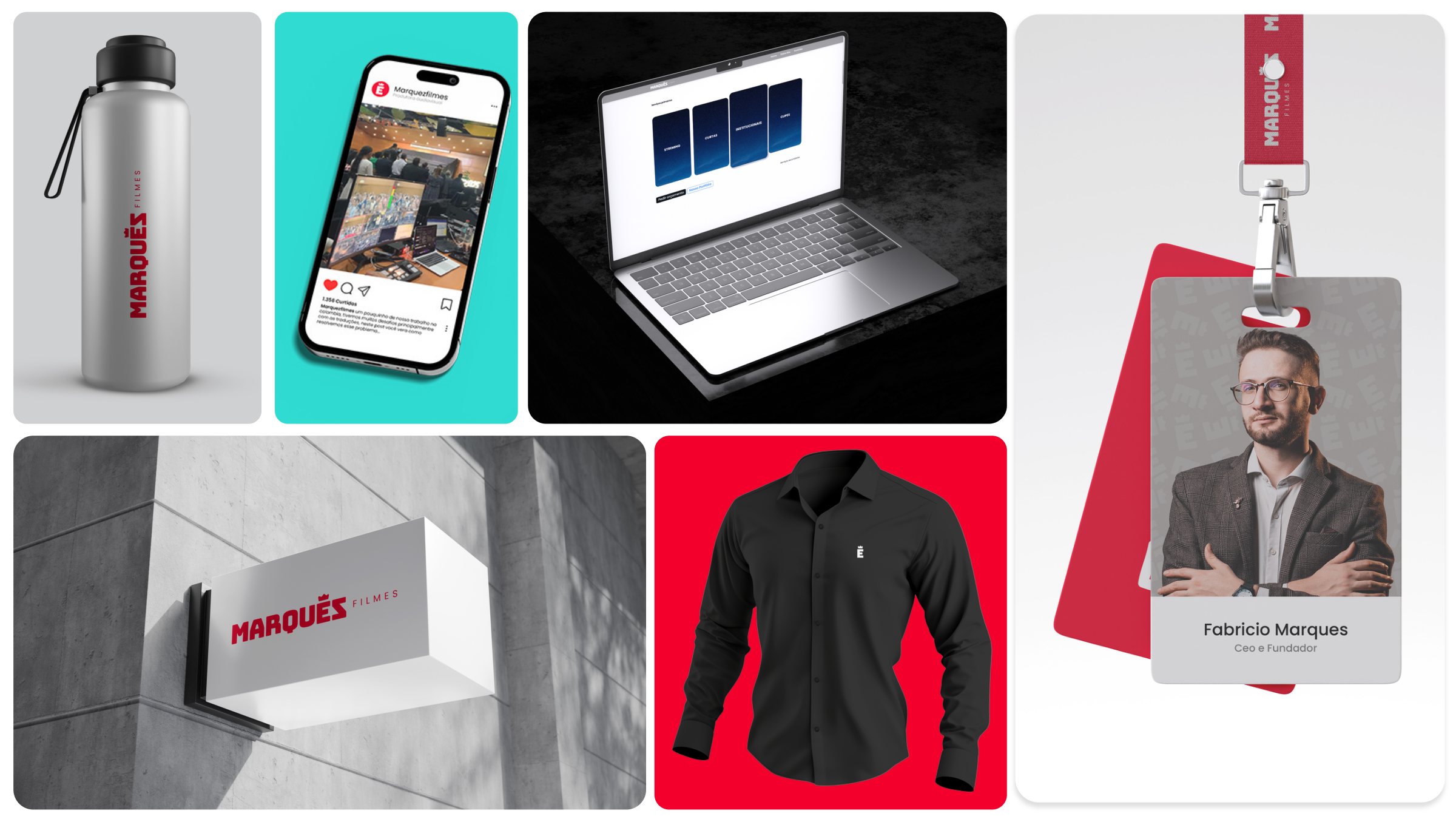
A modular system of applications: bottle, notebook, T-shirt, badge and signage share the same visual grammar.
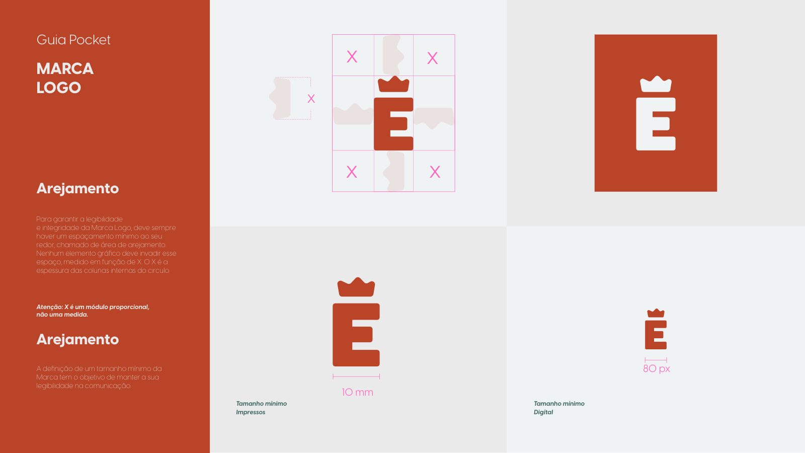
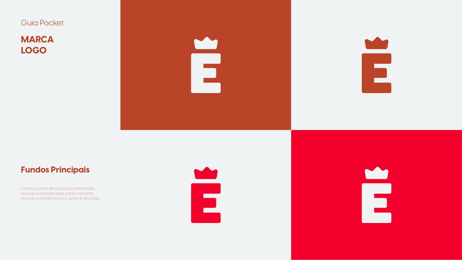
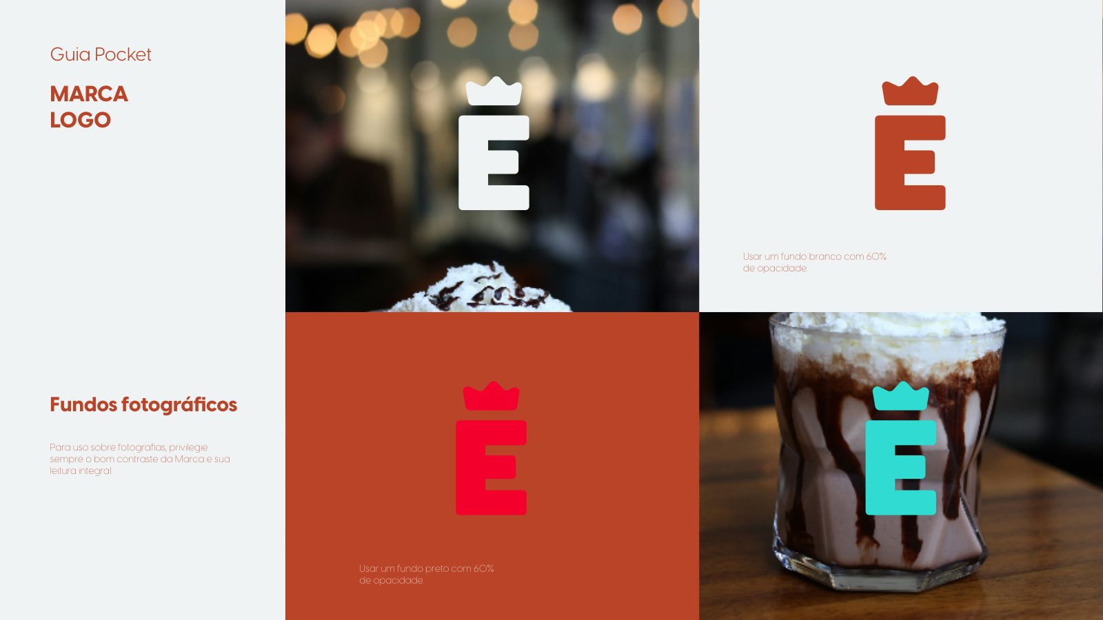
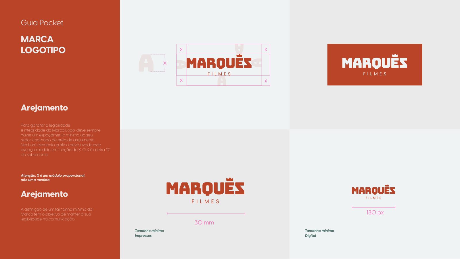
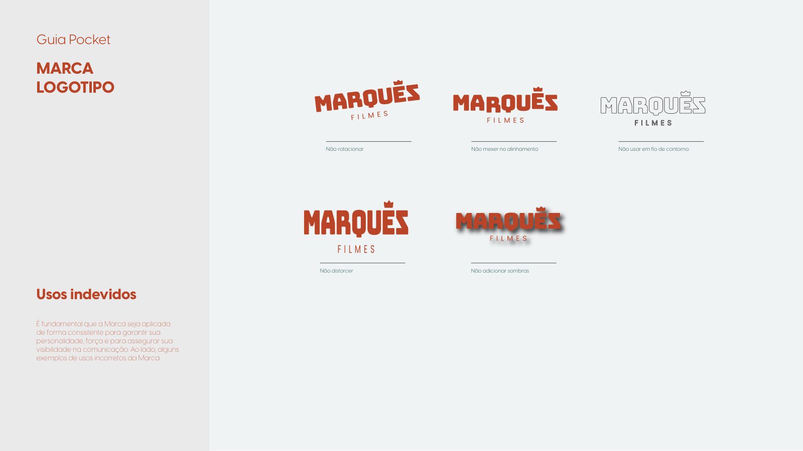
Brand guidelines
Applications
Fabricio Marques is a director, producer and colorist trained in lighting direction and photography. Marquez Filmes is the authorial home where he brings together large productions, live broadcasts and institutional content — always with a cinematic standard and a signature of its own.
The audiovisual segment is saturated with suppliers who promise 'quality' and deliver video. What was missing was a brand that conveyed technical rigor, creative soul and authority — one recognized by marketing directors at institutions that accept nothing less than excellence.
We positioned Marquez Filmes as the Creator archetype — innovation, authenticity and memorable experiences. The manifesto sets the tone: 'We don't make videos. We don't press REC. Every project is a film. Every client, a protagonist.' Authority without shouting, luxury without excess, cinema in every frame.
We built the system from the crown — a symbol of royalty built into the 'M' — reinforcing the noble origin of the surname. Rounded lines balance the rigidity, humanizing the brand without losing presence. Every application, from the slate to the bottle, was tested in a real set context.
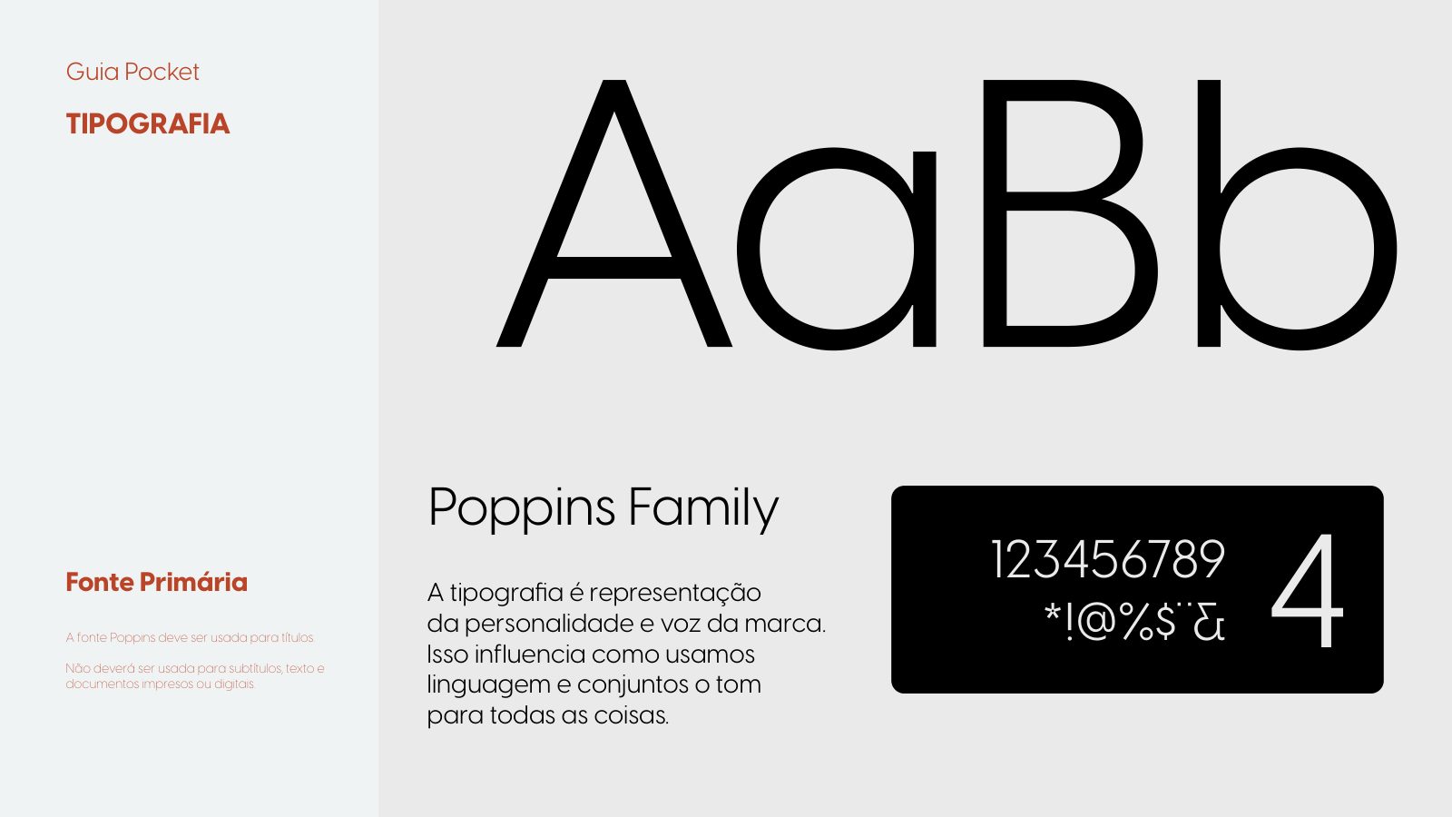
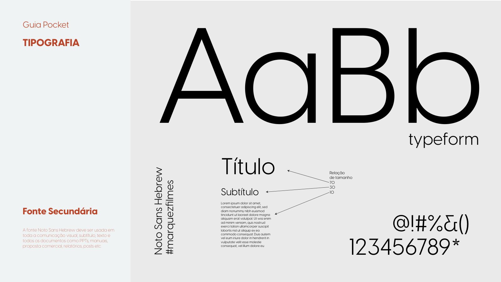
Logotype with a geometric crown over a BUNGEE wordmark — cinematic presence in every application. Primary palette in deep black (#000A0F) and pure white; secondary in vibrant red (#F3002C) and modern cyan (#31DBD2), reserved for gestures of energy. Typography: Poppins for headlines, Noto Sans Hebrew for body text.
Opening film in a single shot: a silhouette against pink and cyan set lights. Institutional loop — the brand projected on broadcasts and live experiences.
A complete visual system in operation — from the brand book to the booth, from the badge to the institutional vehicles. The company gained visual authority matching the technical standard it already delivered.