Seja um Missionário Bilíngue
Be a Bilingual Missionary (Seja um Missionário Bilíngue) is a Bible class in English: participants study the Sabbath School lesson while learning the language. We created the project's complete identity — from the symbol to social media, from the opening sting to the printed materials.
- — 01
Communicating religion, language and education in a single brand without feeling like a school or too institutional.
- — 02
Creating a symbol simple enough to become a profile icon and a stamp.
- — 03
Keeping the same visual pattern across social media, print and objects.
- — 04
Presenting the new look to the community without losing the project's recognition.
- + 01
A speech bubble shaped like an open book — conversation and the Word in the same symbol.
- + 02
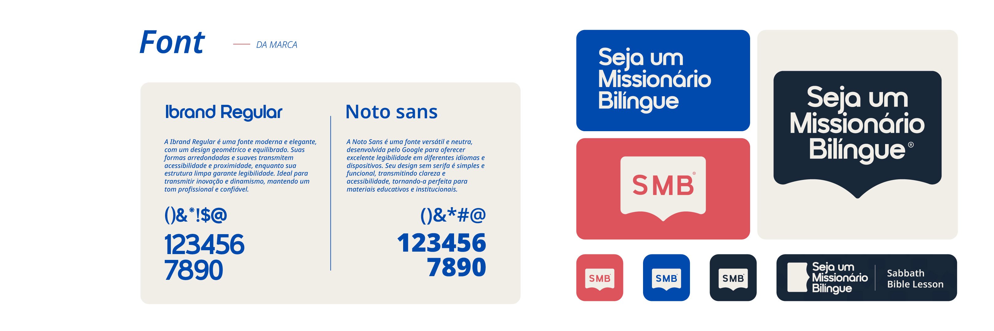
The acronym SMB as an icon, in three color versions for any background.
- + 03
A palette with meaning: blue for global reach, wine for purpose, gold for wisdom.
- + 04
A graphic pattern of its own, applied to the bottle, bookmark, stamps and banners.
Brand guidelines

Applications
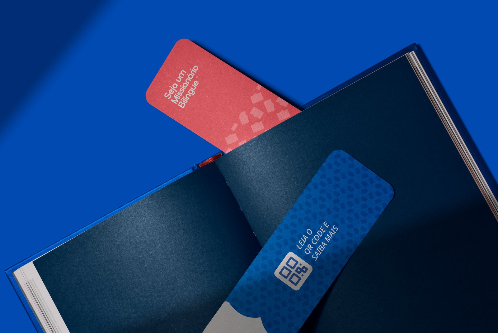

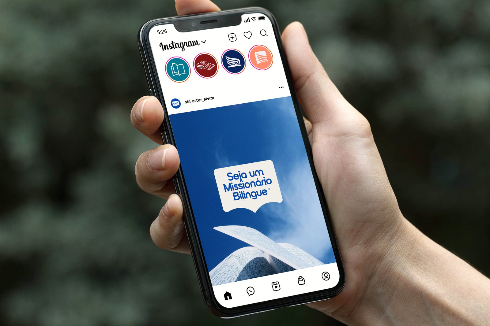
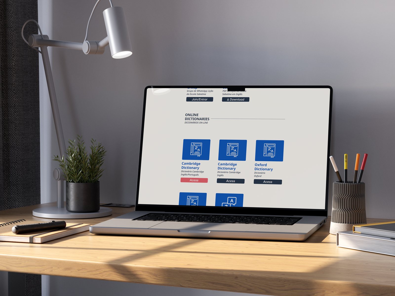
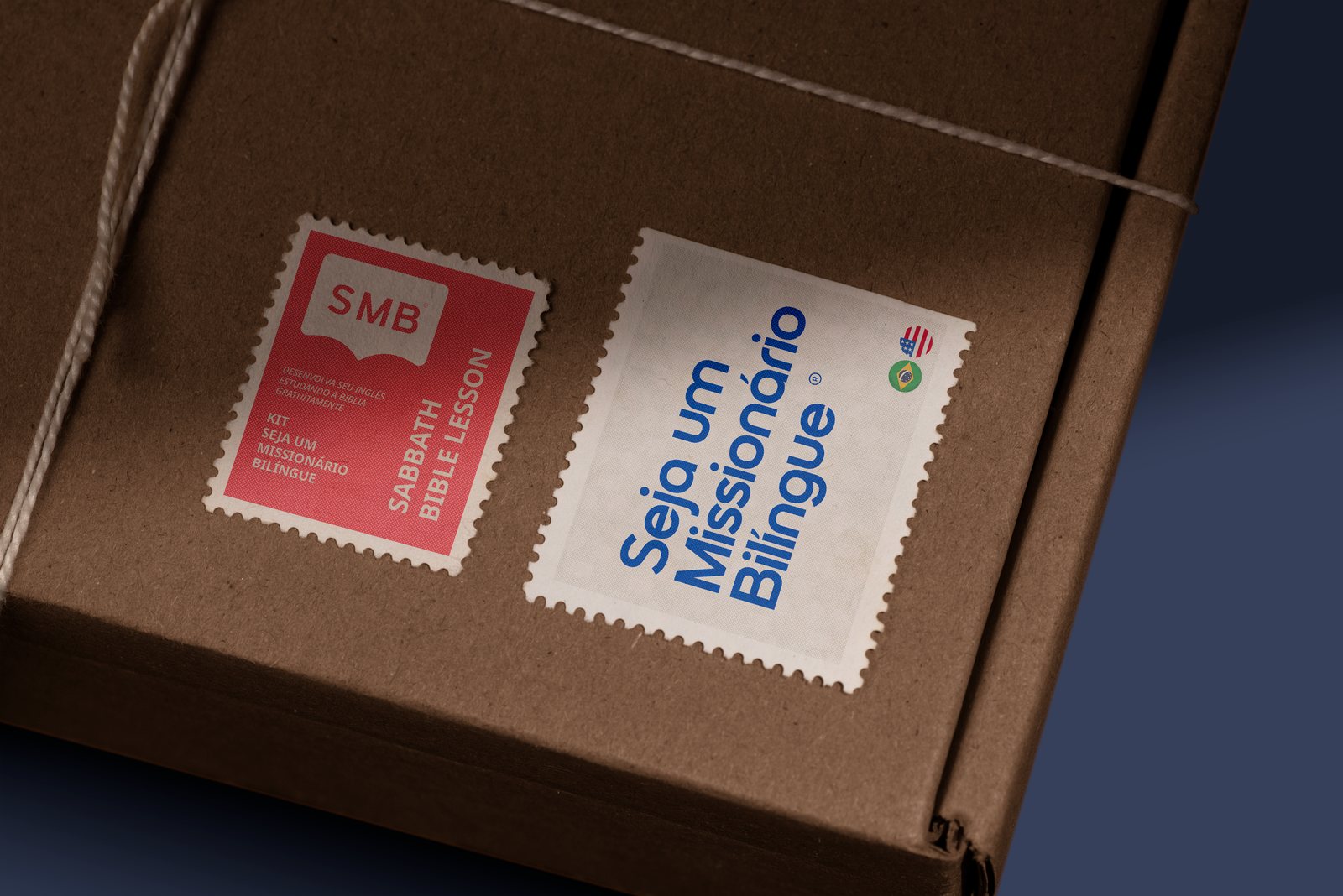
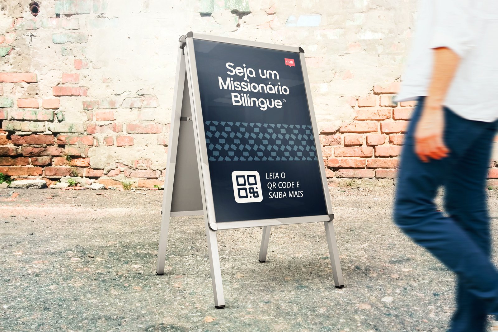
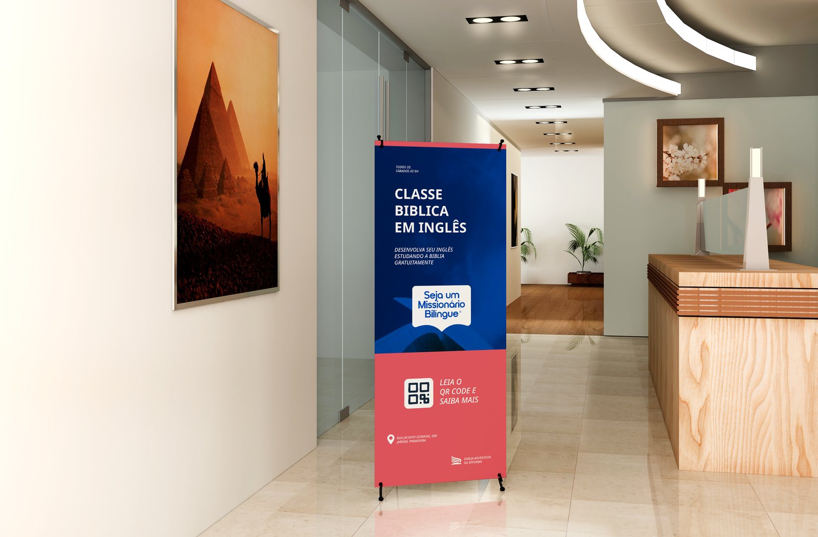
The project joins two callings: learning English and preparing to serve. The communication had to welcome those who are just starting and, at the same time, convey seriousness and purpose to those who support and promote the class.
Missionary projects often have improvised communication, with generic symbols and no consistency between materials. What was missing was a recognizable brand that worked on Instagram, in print and digitally, and explained in a few seconds what it is about.
The brand speaks like an invitation: direct, optimistic and global. The speech bubble opened like a book joins the project's two axes — conversation and the Word. The signature 'Sabbath Bible Lesson' makes the link with the weekly lesson clear.
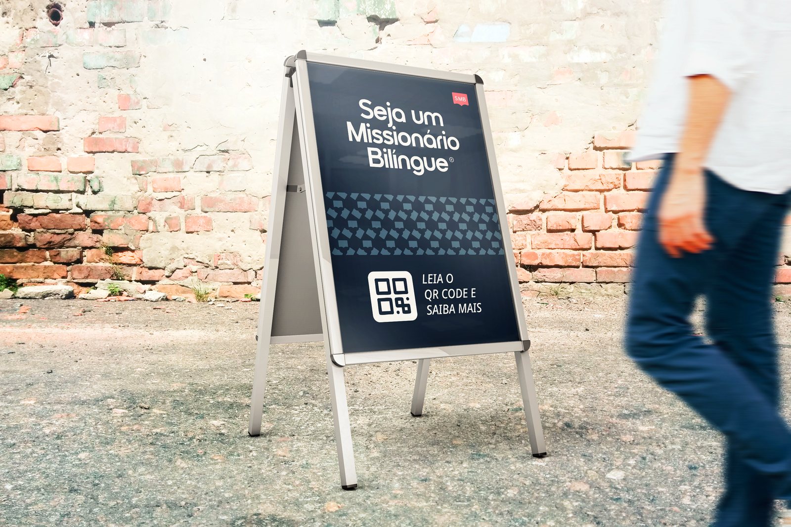
We built the system from the SMB symbol and the Ibrand logotype, with blue, wine and dark-blue versions for different backgrounds. Then we designed the graphic pattern, the posts announcing the new look and the applications: bottle, bookmark, stamps, A-frame sign, banner and website.
Logotype in Ibrand Regular inside a speech bubble shaped like an open book, with the reduced 'SMB' icon. Palette: horizon blue (#004AAD), purpose wine (#DC545C), wisdom gold (#ECD713), faith blue (#182738) and hope beige (#F1EEE8). Supporting typeface: Noto Sans.
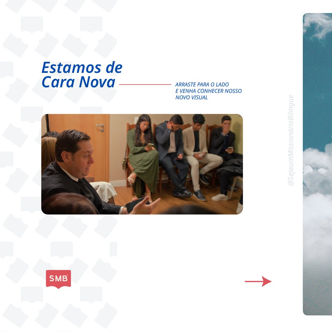
An animated opening sting and Instagram posts to present the new look to the community — 'We have a new look'.
A complete brand system, ready for social media, print and physical spaces, giving the project a consistent and professional presence.