Imersão Voe Alto
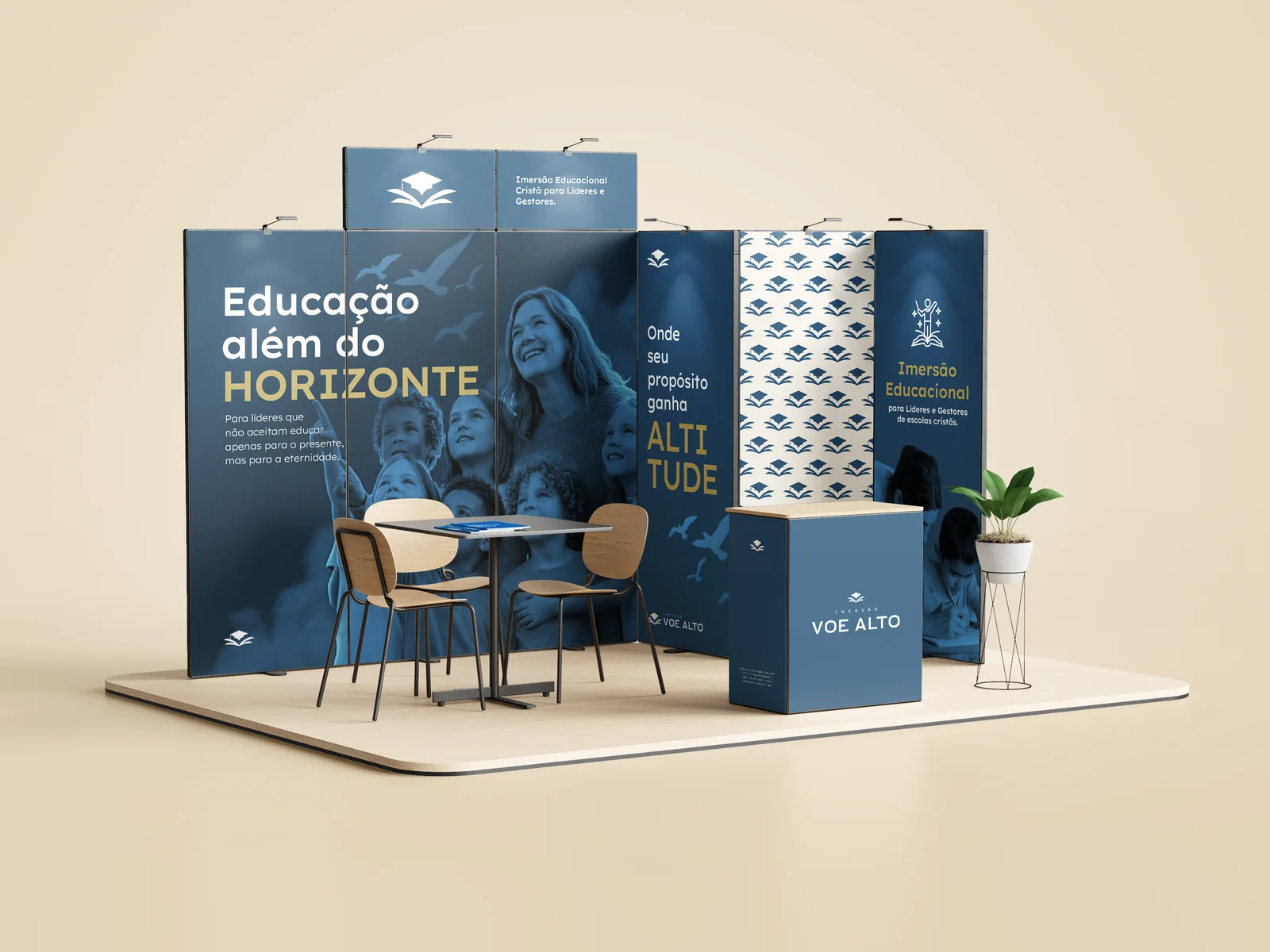
Imersão Voe Alto (Fly High Immersion) is a gathering for leaders and managers of Christian schools. Specialists come together around a single question: how to educate not only for the present, but for eternity. Our work was to build the complete identity of this calling — from the symbol to the physical experience of the booth.
- — 01
Translating Christian spirituality and educational authority without falling into obvious iconography.
- — 02
Sustaining a brand that works both at the lecture and on the gifts, the badge and the booth facade.
- — 03
Differentiating the event in a segment saturated with generic education communication.
- — 04
Building visual social proof from day one — even before the manual was finished.
- + 01
The book-bird symbol: an organic metaphor that joins knowledge (book) and elevation (flight) without resorting to crosses, doves or stained glass.
- + 02
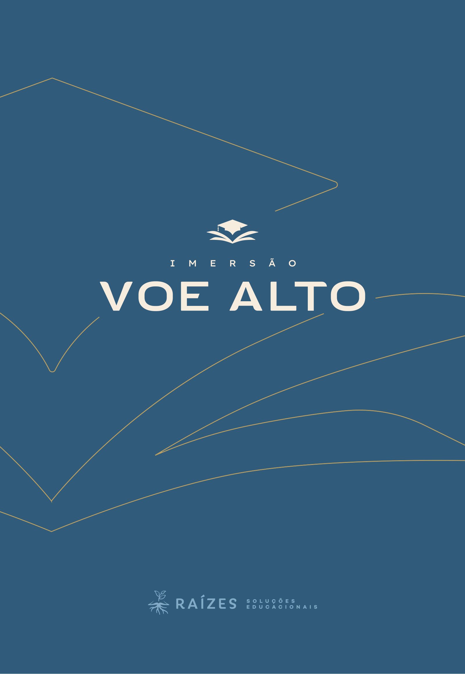
A palette restricted to midnight blue and gold — Christian sobriety without religious cliché.
- + 03
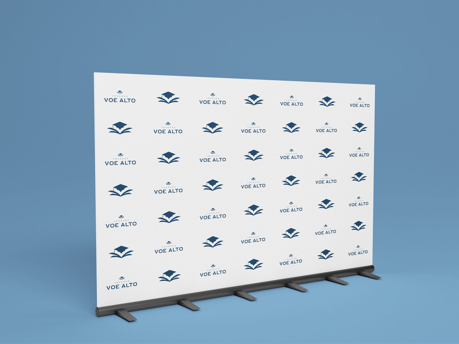
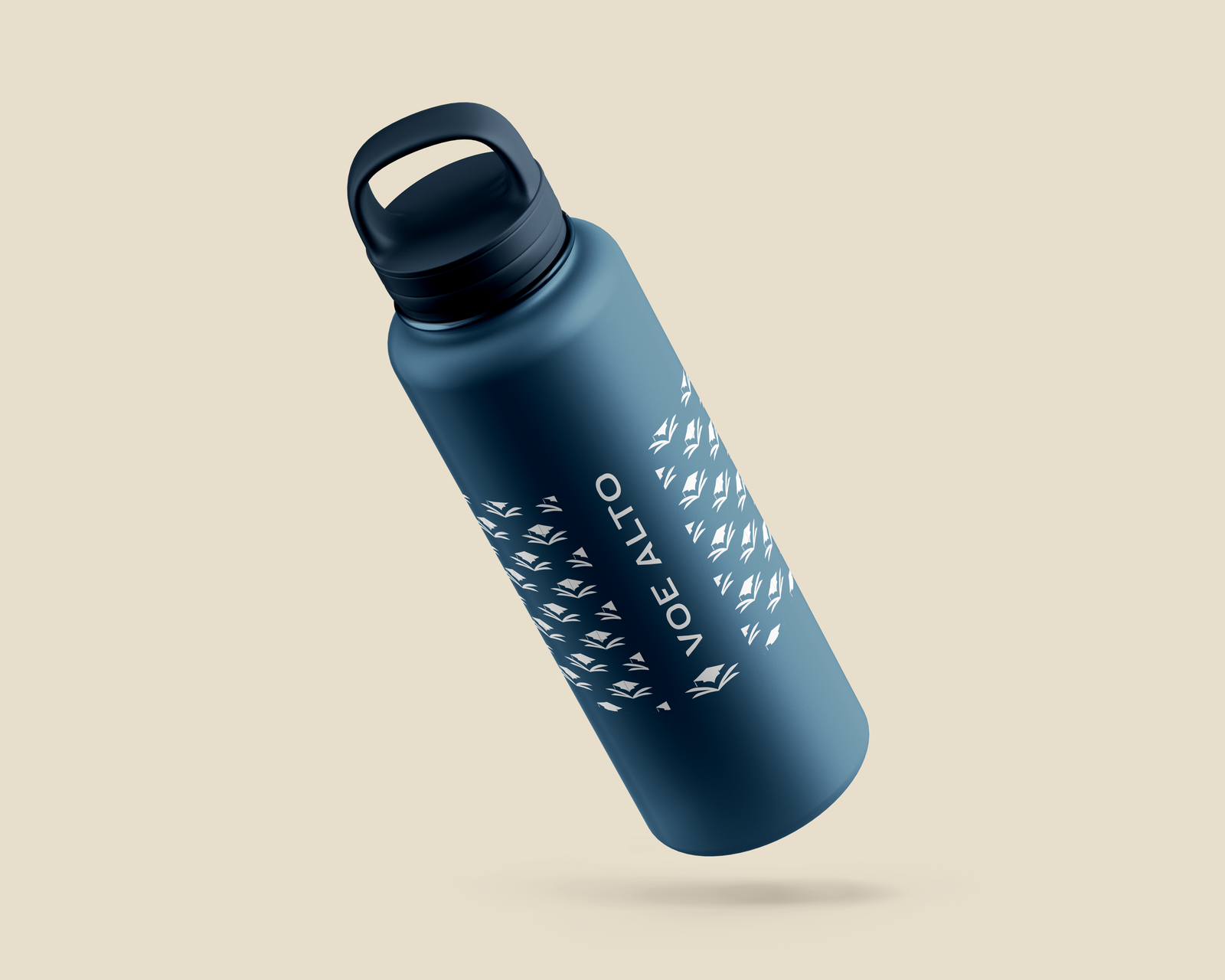
A modular system of applications: badge, booth, stationery, mug and bottle share the same visual grammar.
- + 04
Photographic record of the first event as the brand's cover — the real experience as the argument.
Applications
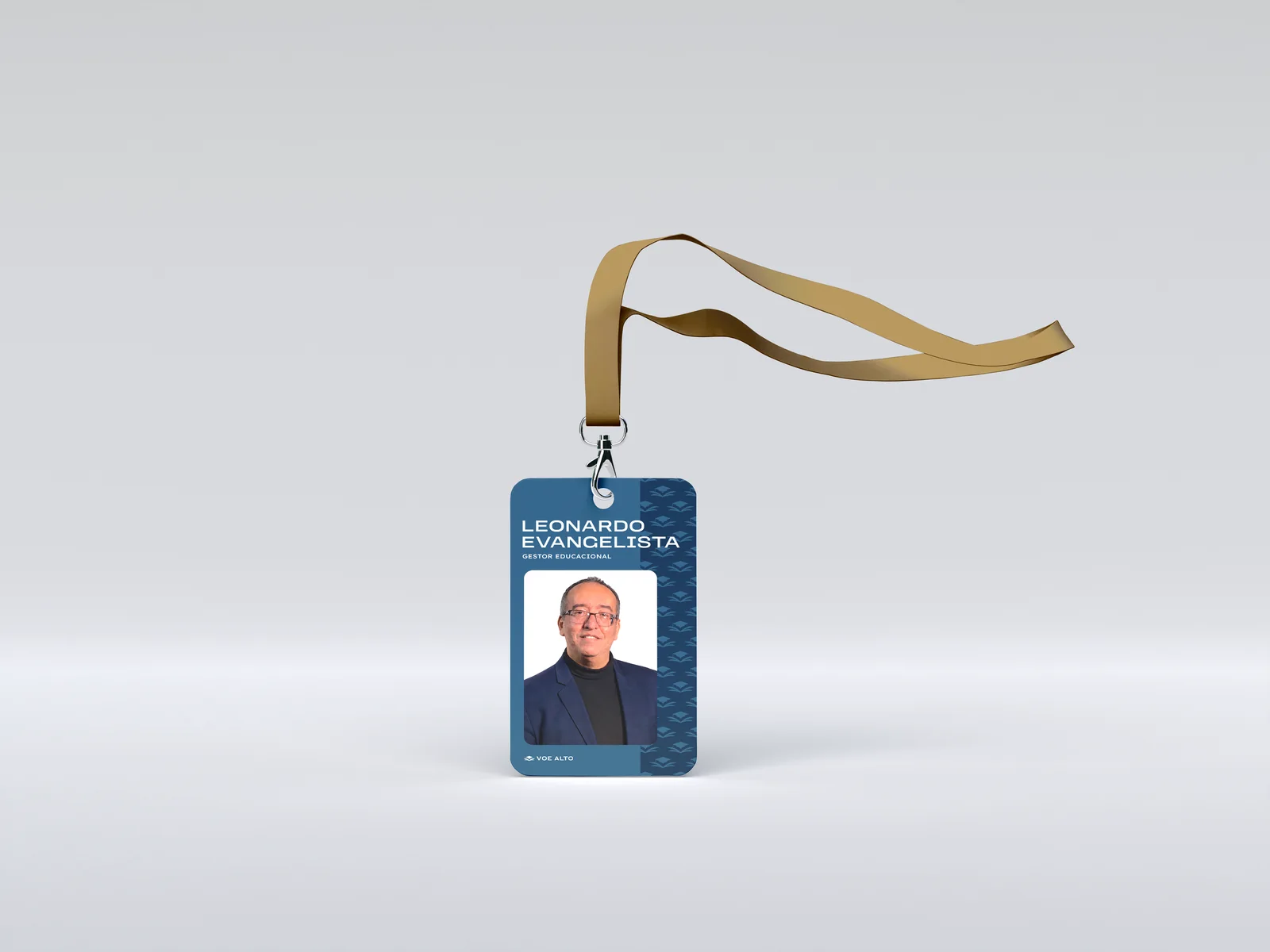
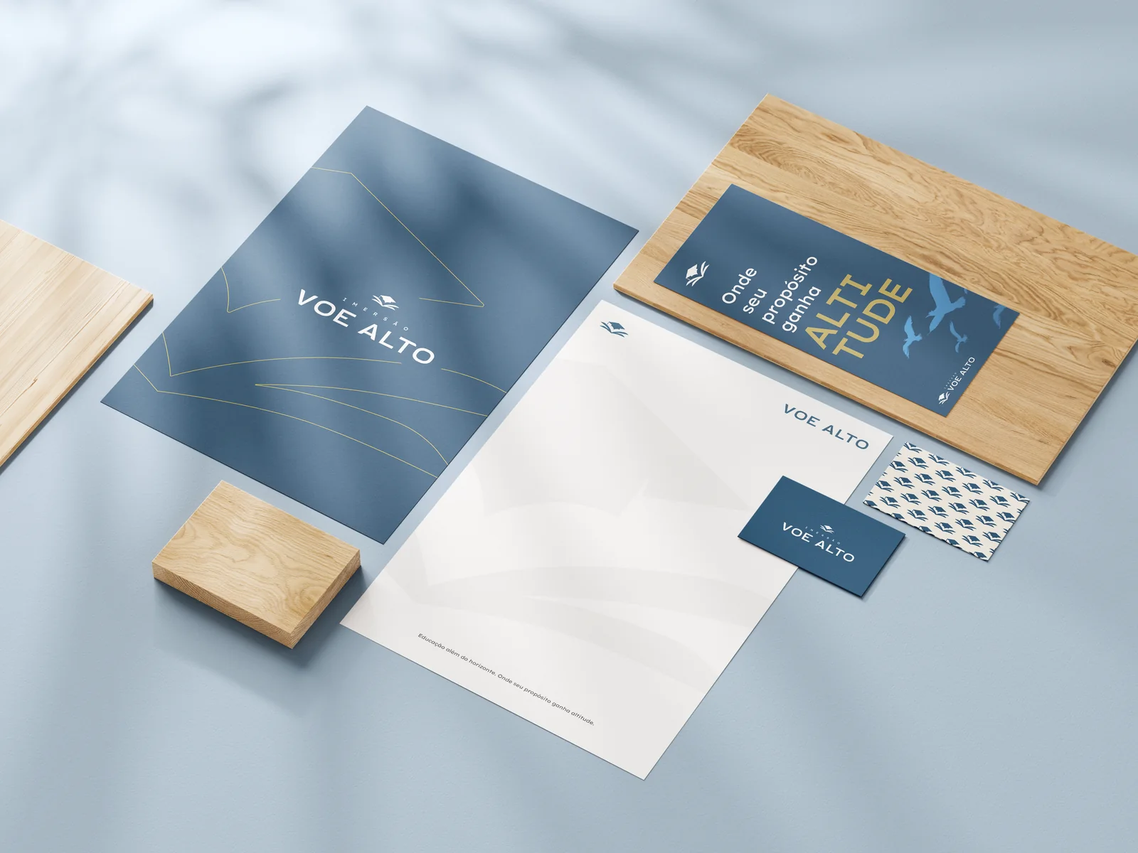
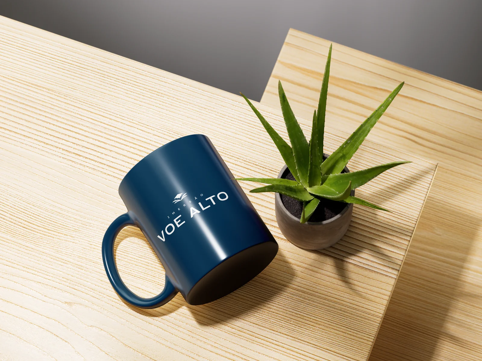
The project was born from the need to bring Christian educators together around the four pillars of human development — intellectual, physical, emotional and spiritual — in an event worthy of the depth of the theme. The audience is highly qualified: managers, leaders and decision-makers of Brazilian Christian schools.
Communication in Christian education is saturated with religious clichés, generic images and shallow speeches. What was missing was a brand with visual authority — one that conveyed eternity without being obvious, and that could hold up both the lecture and the mug on the table.
We positioned Voe Alto as a horizon, not a course. The manifesto — 'Education beyond the horizon. Where your purpose gains altitude' — guided every decision. An open book as the symbol, birds rising as a metaphor, midnight blue and gold as a restrained palette.
We built the language from the gesture of flight: the book that opens like a wing, the bird crossing the horizon, the mortarboard crowning purpose. Every application — from the badge to the booth — reinforces the same scene: silent elevation, anchored in depth.
Authorial symbol: an open book with a mortarboard and a sprout — the education that sustains purpose. Palette in deep midnight blue, warm gold and soft neutrals. Condensed all-caps typography for the wordmark, a humanist sans for institutional texts. A graphic pattern of books in formation, like a migrating flock.
A key video piece with the broadcast of the inaugural event — the brand projected on the screens, the auditorium full, the audience immersed. A record that serves as social proof and as an invitation to the next editions.
A complete visual system underway — from the symbol to the event's physical applications (booth, badge, stationery, gifts). The event brings partner schools and sponsors together around a single purpose in Alphaville, on September 15.